


Responsive web design has become the standard way of designing websites over the past couple of years, as a way of ensuring that a site is readable and usable on a range of viewing devices, from smartphones to large PC browsers. The vast majority of sites that Hughes & Co Design build now for their customers in Colchester, Essex, London and beyond, are designed to be responsive.
Here we answer some of the most commonly asked questions about responsive web design, to help you decide whether it’s a direction you need to consider for your site.
What is Responsive Web Design?
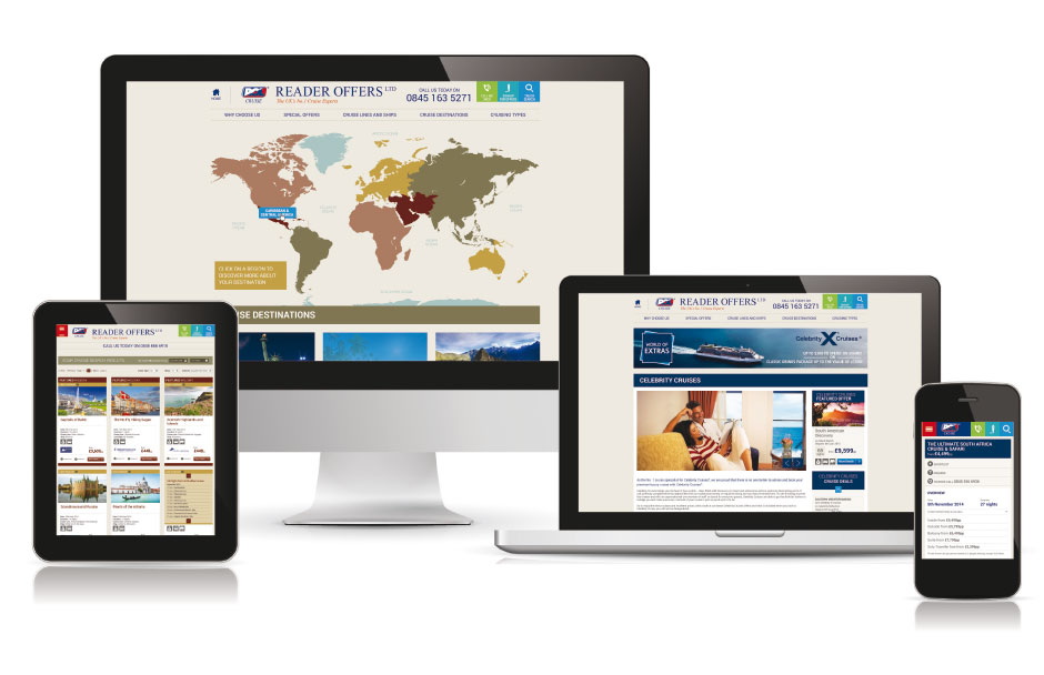
Responsive website design involves designing a site which automatically adjusts itself and the way it displays content, depending on the size of the viewing device. The site detects the dimensions of the viewing device and follows page viewing rules coded within the website itself. Particular aspects which are typically self-adjusted include:
- Images are automatically resized to fit within the screen.
- Text wraps dynamically as the screen width is reduced.
Elements on the page rearrange themselves to fit e.g. elements arranged horizontally on a wide screen will switch to a vertical arrangement on a narrow screen.
Is it the Same as Mobile Website Design?
No. Mobile website design involves designing a site to work specifically on mobile phones with small viewing screens, but not on larger browsers. This involves having two sites, usually on two separate domains, one of which is optimised for small mobile screens and one which is optimised for larger screens. While this was a good interim solution for some sites, for a while, it’s not a good long term approach for a few reasons:
- You have two sites to operate and maintain, instead of one, which doubles the workload and creates version control issues (to keep the sites consistent with each other).
- Having two separate domains means you have 2 sites competing for search engine traffic instead of one, so SEO effort is increased. For instance, all the backlinks that may be helping your desktop friendly site will not provide any SEO benefit to your mobile friendly site.
Why Do I Need It?
The one simple reason for needing responsive web design is the massive growth in mobile internet usage over the past 5 years, due to the huge take-up of smartphones and tablets amongst consumers. It’s becoming increasingly common for households to contain only smartphones and tablets, with no desktop PC at all. This trend meant that in 2015 the number of mobile searches exceeded the number of desktop searches for the first time. In other words, internet users are looking for what they want using mobile devices more than half the time – so it makes sense to ensure that they can find your site using their mobile device, and can easily read and interact with it when they do.
The need for a responsive website design was becoming inevitable, but the point was given extra urgency when Google changed its search algorithm in April 2015, explicitly favouring sites with a mobile friendly design, and beginning to penalise sites without. This saw a widespread move to responsive designs, especially among companies keen to retain their Google rankings.
The upshot of this is that responsive web design is now, effectively, standard web design.
In 2014, an estimated 11% of websites were responsive. In 2015 this had shifted to more than 80%, with the percentage increasing even more in 2016. It’s becoming so commonplace, in fact, that in some places you will see the acronym “RWD” being used instead of “responsive web design”.
Is it Difficult to Update a Site to be Responsive?
It has become progressively easier to switch to a responsive site design and any good web design agency should offer this as a standard service for a new site design, or redesigning an existing site.
Web design tools have developed to meet this trend, making it easier for web designers to achieve sites which are both mobile friendly and highly attractive. And website designers, especially those with established web design agencies, will already have the skills and experience necessary to deliver a responsive website.
How Quickly Do I Need to Act?
A year since its original announcement about favouring mobile responsive sites, Google has now announced its intention to further increase the preference given to sites with a responsive design, and further penalising non-responsive sites in mobile search results, providing additional impetus to site owners who have not yet made the switch.
How quickly any particular site needs to update their site depends on 4 things:
- How much mobile traffic the site already gets – A site which gets a lot of mobile traffic now, could progressively lose traffic if visitors find the site difficult to use compared to competitor sites.
- How much mobile traffic the site could potentially get – Even if a site does not depend much on mobile traffic now, they could be significantly limiting their ability to grow their traffic by ignoring the growing mobile search market.
- How well the site ranks in Google for desktop or mobile searches – Those with good rankings currently, stand to lose rankings, traffic and business over time if they do not switch soon.
- Whether competitor sites have switched yet – If all your competitors have responsive sites you need to consider switching as soon as possible. If few or none of them have switched, you may have more time. But you would give yourself a significant competitive advantage by making the change ahead of your competitors.
Apart from Rankings, Are there Other Benefits?
One of the major benefits of a using a responsive design is the positive impact it has on overall customer experience. A site which is easy to use and which always makes sense on whatever size screen or browser is being used, will contribute to keeping customers on your site. Ultimately, this increases the chances of a visitor turning into a paying customer or lead for your business. Even without the Google factor, this makes a compelling case for moving to a responsive design.
Responsive Web Design by Hughes & Co Design
Hughes & Co Design has been delivering responsive websites for a number of years now and switching to a responsive design has never been so essential.
Web Design Colchester – Contact us about your web design or redesign needs today, or view our portfolio for examples.
Our Work


Hughes & Co Design
Moorside, Colchester, CO1 2TJ
Tel: 01206 795 933
Fax: 01206 795 944
Email: creative@hughesandco.com