

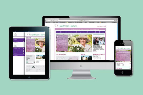
Responsive website design is when a website has been designed to adapt its viewing dimensions and content for display on a PC, laptop, tablet or smartphone so users get the best possible experience, irrespective of the device they are using.
So why is responsive design important? The number of people accessing the internet via mobile and tablet devices has more than doubled in the last three years. By the end of 2014, mobile and tablet use are predicted to overtake desktops and laptops as the technology we use to stay connected becomes ever more portable.
We are becoming an increasingly mobile society, even down to our correspondence: 26% of all e-mails are opened on mobile phones, with 10% being opened on tablets. With these stats in mind, smart businesses will give their online customers the same quality of experience they’ve traditionally enjoyed on their desktops on sites that adapt to being viewed on a range of devices.
Whilst we’re communicating on the move, conversely we’re increasingly shopping from the comfort of our sofas, tablet in-hand in front of the TV. A recent survey showed that 67% of online shoppers are more likely to buy from a responsive website, with 61% of people saying they favour brands that offer a good mobile experience.
Whether you’re browsing or shopping, responsive design not only provides a fast, easy website experience for an ever-increasing number of people but reinforces the online presence of the companies in question and ultimately strengthens their brands.
When it comes to ensuring your business is at the forefront of the mobile website revolution, will you respond and be responsive?


