

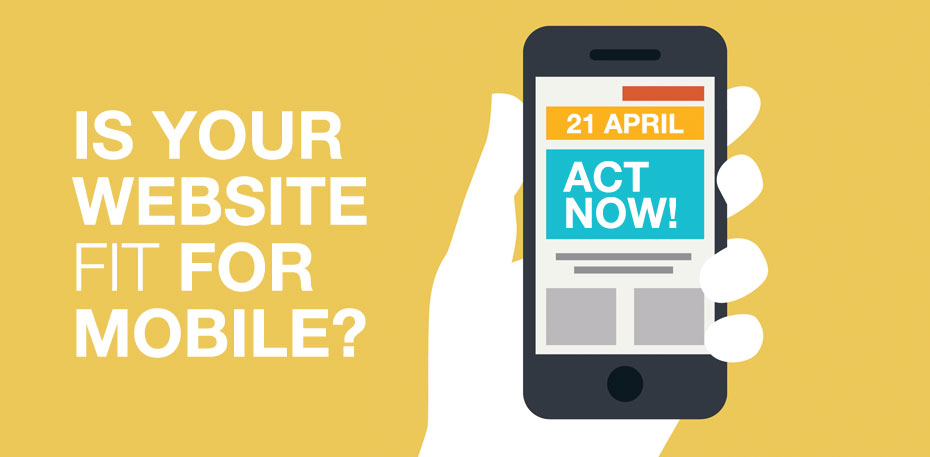
Is your website fit for mobile? Google’s algorithm change on 21 April will revolutionise how your websites rank if they are not mobile friendly.
Is your website fit for mobile?
The internet is experiencing a revolution, whatever industry you’re in your audience is switching to smartphones and tablet devices as the principal way to browse websites
If you don’t have a mobile-friendly website, safeguarding your brand visibility for online visitors and don’t know where to begin? Here’s our guide on how to make your website fit for mobile.
Does your website need to be mobile friendly?
Short answer, yes it does. While desktops remain important, people browsing using tablets and mobile devices has been steadily rising year after year, so it is worth getting your website up to scratch for a better chance of taking advantage of a growing audience.
Not having a mobile-friendly website can also hurt your rankings in search engines. When searching on a mobile phone, Google will add a note in the listings that tells searchers that your website is mobile friendly, which will not show if your website is not suited to mobile. This can only help your competitors. On top of this, from April 2015 Google has confirmed that whether or not your website is mobile friendly will be a ranking factor for mobile searches. If your website is not mobile friendly then you can pretty much wave goodbye to great positions in the search results.
Having a responsive website also means there’s more chance of you being noticed.
If your website is not displaying correctly on mobile, or is incredibly difficult to use, the chances of the consumer persevering is very unlikely – especially if there are more aesthetically pleasing and uncomplicated sites offered elsewhere.
Having a mobile-friendly website will also be beneficial for social media marketing campaigns. For instance, if you have a website that is easy to navigate and access, it’s more likely that the user will be able to find a special deal and then share it on Facebook, Twitter or other social media channels. From the aspect of you promoting on social media, the user is more likely to interact if the website they are being directed to is well designed and user friendly.
How do you know if your website is mobile friendly?
It takes less than a minute to find out: click here to take Google’s mobile-friendly test.
How to improve your website
Keep it simple
Relevant content is always critical to inform your audience about your offering, however lots of text can be off-putting. The appearance should be clean and sharp, showing the user what they need in just the right amount of words. While desktop sites look great with lots of images and graphics if they aren’t optimised for mobile they can come across as irritating, no matter how pretty they are.
Put the most important call-to-action first
In order to make your website as user friendly as possible, you need to consider your call-to-actions and make the most important the easiest to achieve. This may include, an enquiry form requesting a call back or a brochure, or your phone number if you’re driving your audience to call you. With this in mind, you need to gear website towards these actions, making it easy for the user to make these conversions at every position whilst browsing the site.
Speed is a priority
Speed and efficiency, having a slow mobile website is a certain way to detract users. If you have already adopted a strategy of simplicity, your site shouldn’t lag; the main culprits for slow websites are large graphics, videos that autoplay and too much copy, so watch out for these things.
Our Work


Hughes & Co Design
Moorside, Colchester, CO1 2TJ
Tel: 01206 795 933
Fax: 01206 795 944
Email: creative@hughesandco.com