Graphic Design & Branding Trends to Watch in 2017
The world of graphic design changes fast, particularly when it comes to branding, so it’s important to choose a design agency that keeps in touch with the latest trends – and can translate these trends into logo and website designs that look contemporary while also expressing their brand’s personality and values. Here Essex based designers Hughes & Co Design look at 6 of the most current graphic design and branding trends which are going to be having a big impact in 2017.
Individuality
Perhaps as a reaction to corporate globalisation and the ubiquity of design from every quarter, there is a strong trend towards being unique and showing personality. This trend works for new brands that want to stand out, as well as established brands that want to be more relatable and less corporate.
There are two particular sub-trends within this trend which can both be used to inject extra originality:
Hand-drawn Logos and Graphics –This can be a way to achieve a high-end, boutique look, which conveys the personality of the brand. For this approach to work, it has to be executed very well to avoid looking amateur and end up detracting from the brand.
Vintage Lettering and Layouts – For established brands with a heritage to draw on, this might mean bringing back elements of older logos that give customers a strong sense of nostalgia and trust in the company. For new brands, it’s a way to communicate a sense of old-fashioned values.
We can almost think of this as an “anti-trend” trend, where the object is to be different to others, rather than the same. So expect to see original photography, unusual font choices and innovative colour combinations.
However, all this originality does not equate to random! It requires a high level of skill to implement this trend properly, so using a professional designer is more important than ever.
Flat and Clean
Flat graphics was a strong trend in web design in 2016, due to the growth in mobile responsive websites and the need to ensure that graphics that would look good and be easily legible at both large and small scale on a range of different devices (e.g. desktops, tablets and smartphones).
Brands are realising that their logos need to be similarly legible at all sizes, and many are adopting simplified versions of their logos, with unnecessary detailing stripped out. Along with this trend comes simpler, uncluttered, sans-serif fonts.
The design challenge with this trend is to create logos which don’t end up being so simple that they become bland and lose their visual impact – so finding an experienced logo designer is essential.
Literal Logos
Brands need their logos to communicate very quickly to their customers what they actually do, so abstract design is taking a back seat and logos which are a little more illustrative are coming to the fore, particularly for niche brands and organisations which deliver one key type of product or service.
This Year’s Colour
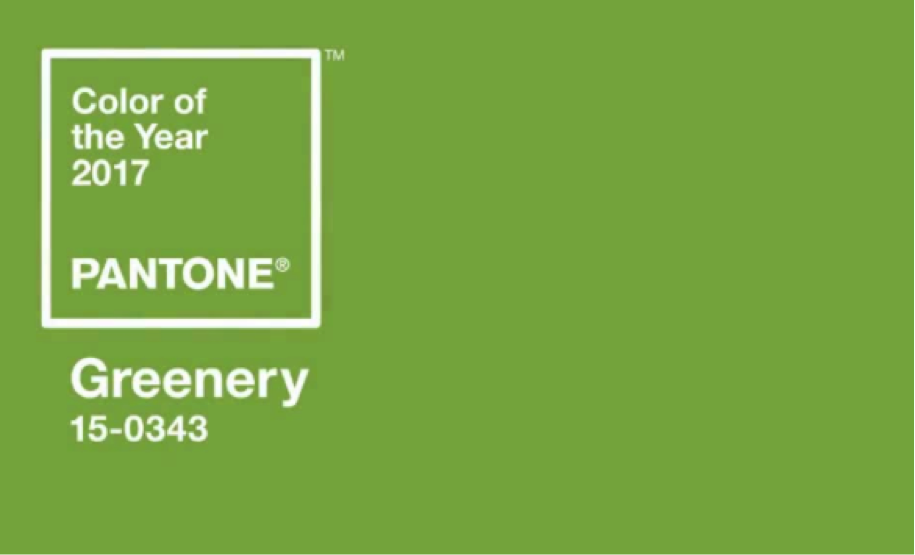
The Pantone colour for 2017 is Greenery. Pantone describe this shade as:
“A refreshing and revitalizing shade, Greenery is symbolic of new beginnings.”
So expect to see shades of the colour itself, along with contrasting and complementary colours. Pantone also describe Greenery as “nature’s neutral” so we can perhaps expect to see greens used as a background colour.
Of course, this colour is a good fit for products and services wanting to emphasise a connection with nature, relaxation, growth and other related concepts. But it can also be combined creatively with black, white and all shades of grey, enabling it to be adapted for less obvious brands, especially those involving a technical aspect such as hi-tech, professional services, online trading or even finance.
Hughes & Co Design – Always On Trend
Staying up to date with trends like these is our raison d’être, and our designers are passionate about delivering logos and brand identities which are both contemporary and highly functional, and which work well in both print and digital media.
Here are two recent examples of our work involving one or more of the trends discussed above:
Brightlingsea Sailing Club
The club wanted an updated logo to be used primarily on their new website. The logo we designed for them shows bold use of colour, with a simple flat design and incorporating a literal graphic element (two sails) in eye-catching, contrasting colours. The typography uses a bespoke font with simplified serifs. The overall effect is contemporary and distinctive.
Chillesford Lodge Estate
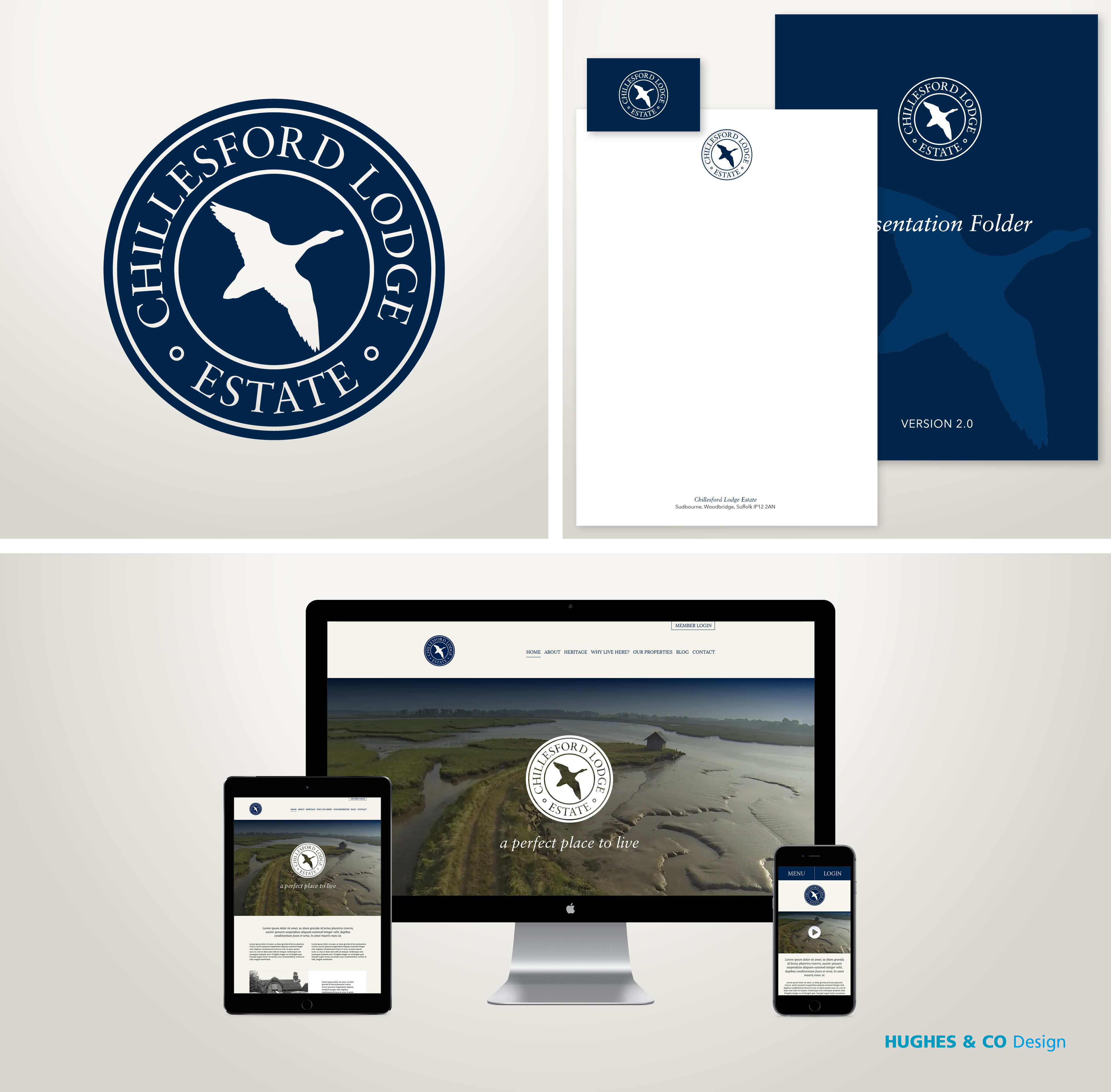
Chillesford Lodge Estate is a unique development of converted grade two listed farm buildings into residential houses. For the development they required a complete brand identity. This included a new logo that correctly positioned the estate and development as modern, yet also acknowledged the heritage and what had gone before. The branding was then rolled out across a fully responsive website, signage and literature.
Hughes & Co Design provide graphic design and branding services to companies in Essex, London and the UK. Find out more about our brand design services or contact us today for more information.


